
Workflow improvement
A failed web form should tell people how to finish
When a form fails, people need to know what went wrong, what they can change and whether anything was already submitted. A useful recovery design preserves appropriate completed fields, connects each error to its field, explains the next action and distinguishes a rejected submission from an uncertain result. These are separate responsibilities. A red border cannot carry all of them.
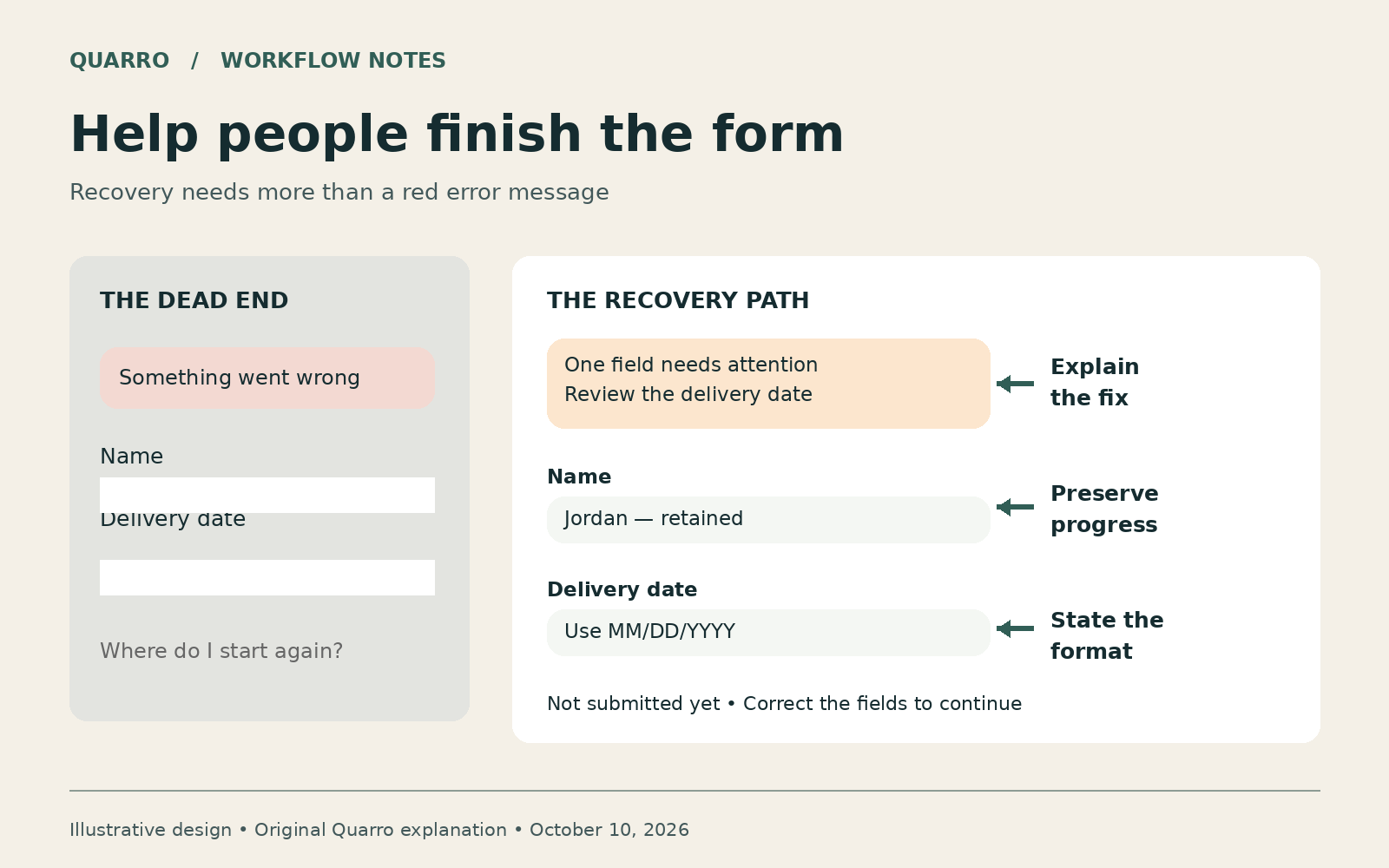
The answer: make recovery part of the form
When a form fails, people need to know what went wrong, what they can change and whether anything was already submitted. A useful recovery design preserves appropriate completed fields, connects each error to its field, explains the next action and distinguishes a rejected submission from an uncertain result. These are separate responsibilities. A red border cannot carry all of them.
Consider an illustrative equipment-rental request. A customer completes a long specification, enters a delivery date in an unexpected format and presses Submit. A generic error returns them to an empty form. The business may see an abandoned session; the customer sees work they must repeat. The problem is not simply the color of the warning. It is the missing recovery path.
Why validation alone is not enough
Basic browser checks can catch a missing required field or an invalid email format. Server checks still need to apply the actual business rules. Adding more validation does not automatically make either layer understandable. A rule such as 'date is outside service window' needs a permitted range and an alternative action. Otherwise the system rejects input without helping anyone complete the task.
W3C's form-notification guidance describes both overall feedback and field-level feedback, including understandable corrections and links from an error summary to affected controls. It also discusses announcing dynamically inserted errors to assistive technology. That is an implementation foundation, not a declaration that any particular form meets every accessibility requirement.
Design three different failure states
First, input needs correction: keep the user on the form, identify the relevant field and explain the accepted value. Do not clear unrelated valid entries. Second, the service is unavailable before acceptance: say the request was not accepted and offer a safe retry or an established alternative channel. Third, acceptance is uncertain: a connection disappeared after Submit. Do not confidently say 'nothing was sent' or invite repeated submissions until the application checks its request status.
The last case links interface design with backend behavior. A reference number and a status lookup can help resolve uncertainty. They must refer to a real stored request. A decorative success screen that appears before storage succeeds is not confirmation.
An acceptance checklist for the whole task
Use fictional data in an authorized test environment. Try a blank required field, an invalid date, a rejected business rule and an interrupted response. Complete the task using a keyboard. Check that the error summary is reachable, each link leads to the right control and the status is understandable with the relevant assistive technology. Confirm that users are not exposed to raw stack traces or sensitive validation details.
Record completion, correction attempts and unresolved submissions separately. An increase in visible errors can mean improved detection rather than a worse experience; a lower error count can hide silent failures. Start with a small set of known failure cases and retain the exact expected behavior for each.
The practical takeaway: specify what the user sees after every failure before calling the form finished. That makes accessibility, customer experience and operational follow-up part of the same delivery conversation.